Mobile Website Design
Mobile First Web Design is better than a separate website for mobile.
- Mobile First Web Design
- Keyword Research
- Media Query For Mobile
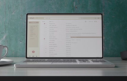
- Responsive HTML Email
Responsive web design maximizes the interaction rate with potential clients in your market. A website that functions well on desktop, but looks like it needs help on mobile or ipad devices has the potential to COST your business money! We'll make sure that's not the case.

Mobile First Web Design is better than a separate website for mobile.
Media queries are the key to making your website responsive.
Knowing that your developers have top knowledge of industry trends and security can put you at ease that your data will NEVER be compromised. Always learning year over year for infinity knowledge.
You can be rest assured that we will make your website responsive to different input devices. We have the knowledge it takes to get through any obstacle.
Regardless of what was used to build your website, we can make it reponsive by adding the appropriate technologies. We are experts in this field since it impacts your bottom line!
We are very professional and keep you and your dreams at the forefront of all that we do. Clear responsive updates are provided throughout the relationship.